Hub Majestic

Give a buy-side real estate intermediary a brand with the weight of architecture, and carry it into a site that turns visitors into qualified leads through a clear story about curation, network and process.
What we did
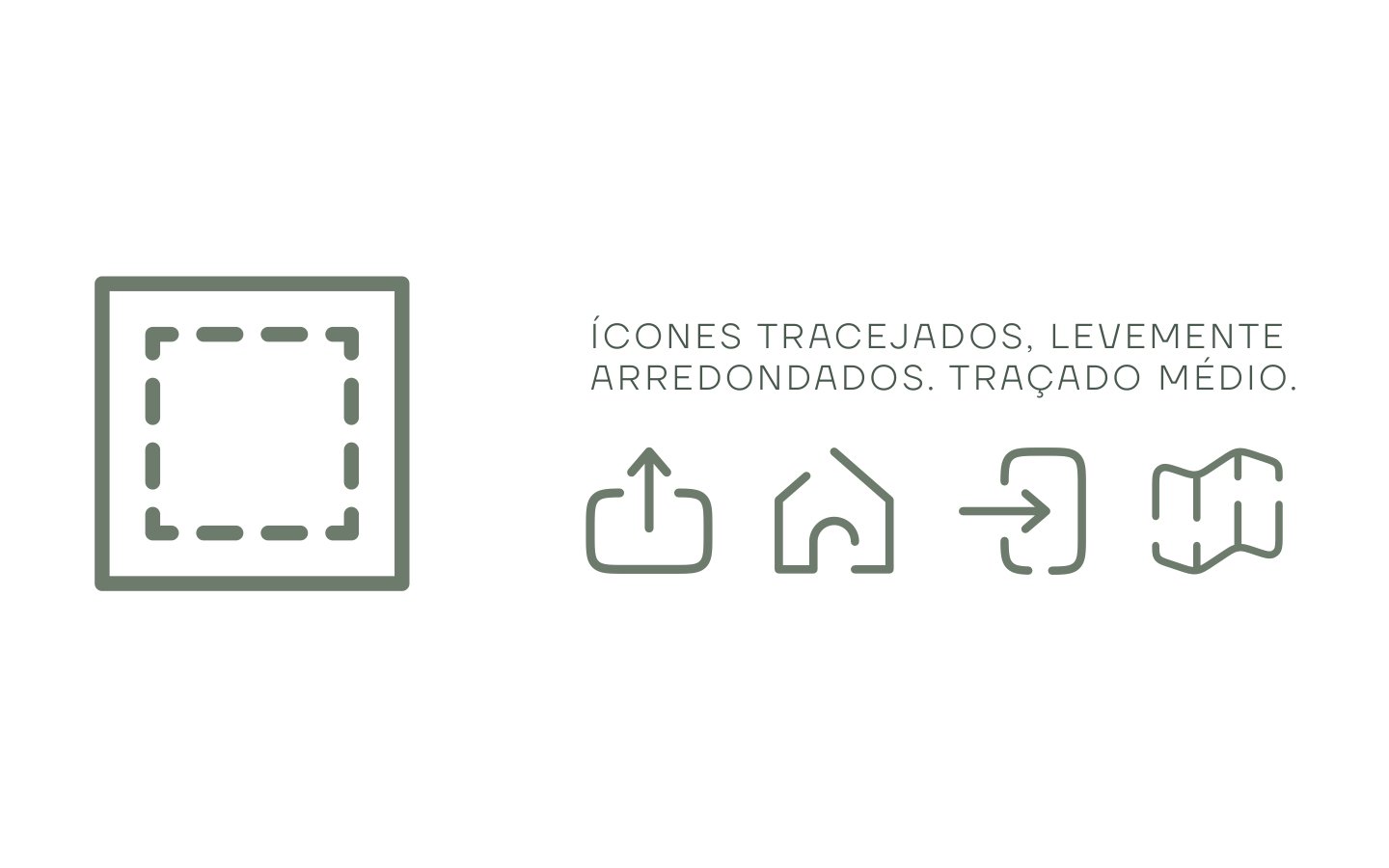
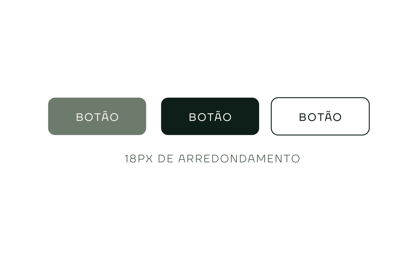
We drew the identity from the M in Majestic: rotated, it becomes a symbol of structure and direction, applied in three colourways. The system has five colours, from Deep Green to Soft Ivory, Asgard Wide for headings and TT Firs Neue for text, outlined icons and buttons with an 18 px radius, and it extends to stationery, bottles, a mug, T-shirts and LinkedIn. On the Next.js site, the same type and greens carry a single page with anchor navigation, Lenis smooth scrolling, a founder video, an FAQ accordion and a closing call with two doors, Sou Comprador (buyer) and Sou Corretor (broker).
We made the form change for buyer or broker, so every lead arrives already qualified.
Identity
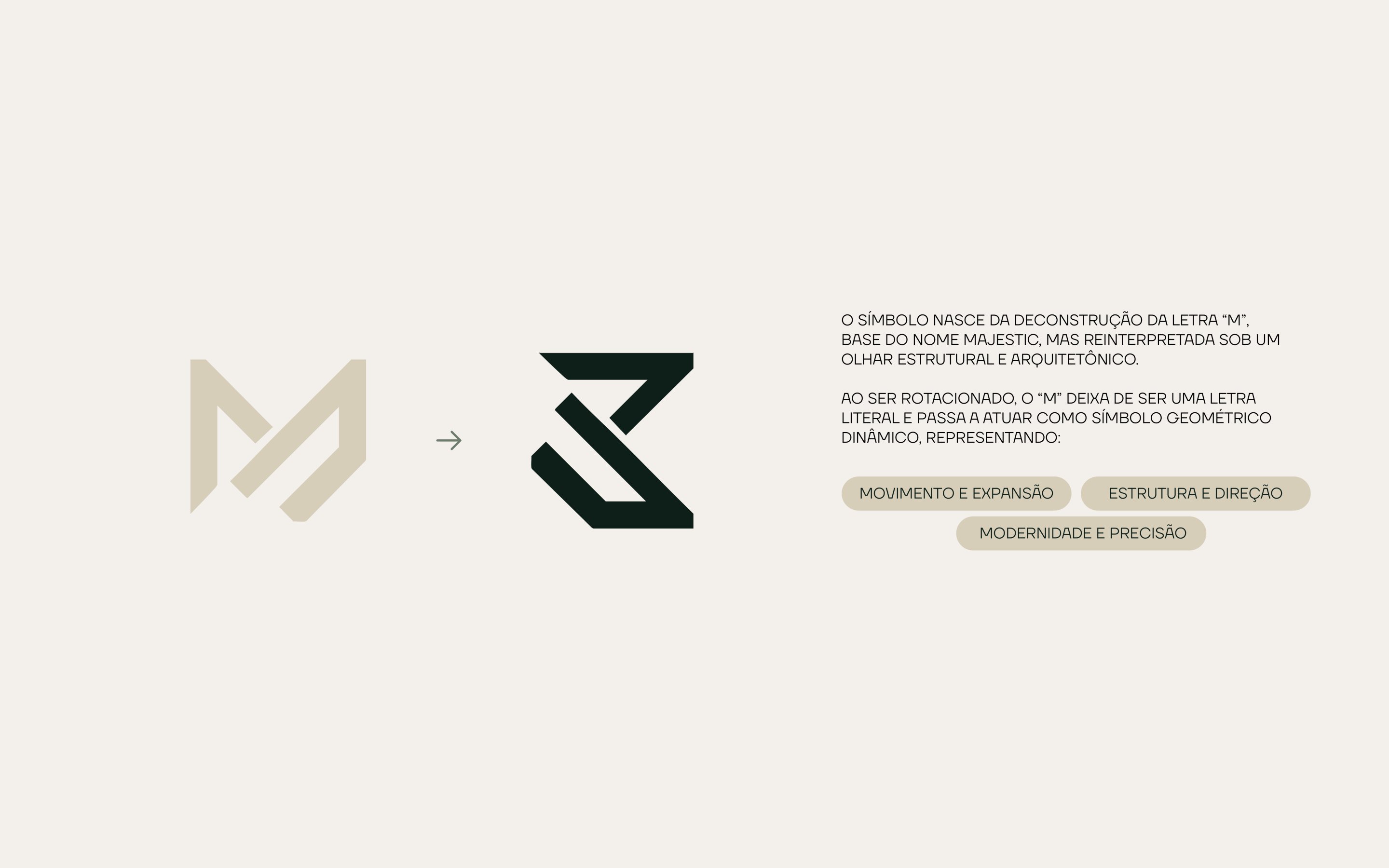
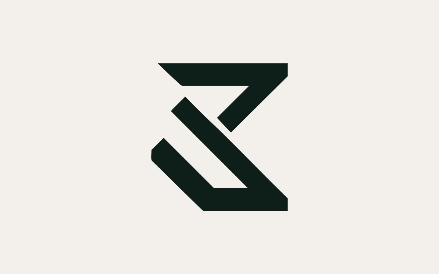
The symbol comes from the M in Majestic: rotated, it stops being a letter and speaks of structure, direction and precision.
Building the symbol
We started from the letter and turned it until it became a shape: the M stops reading as a letter and works as a geometric symbol of movement and expansion.

System
Five colours drawn from architecture and land, Deep Green to Soft Ivory; Asgard Wide for headings, TT Firs Neue for text.
Applications
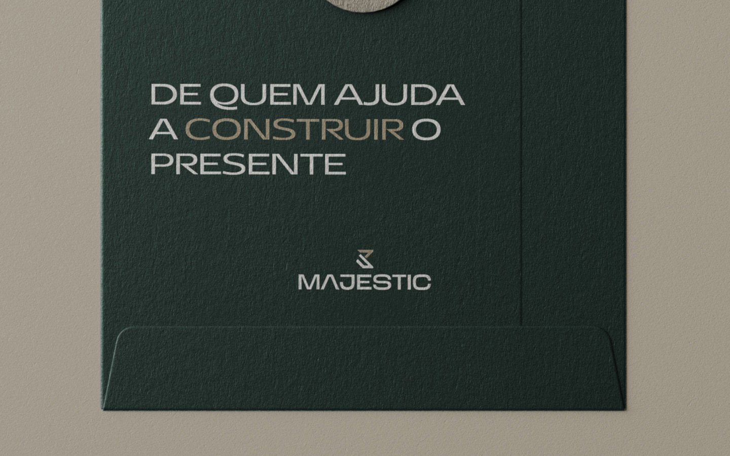
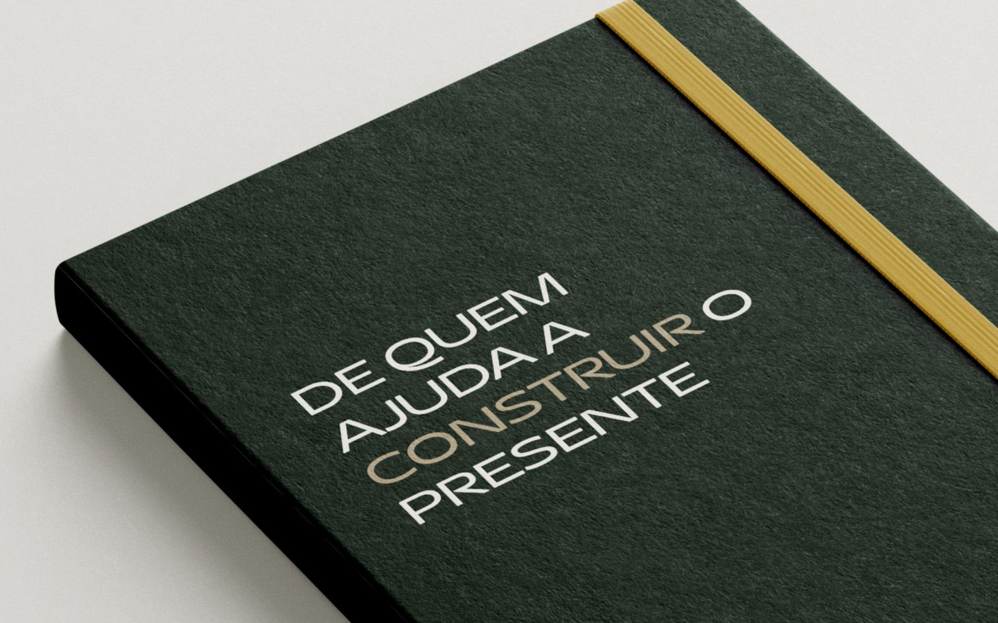
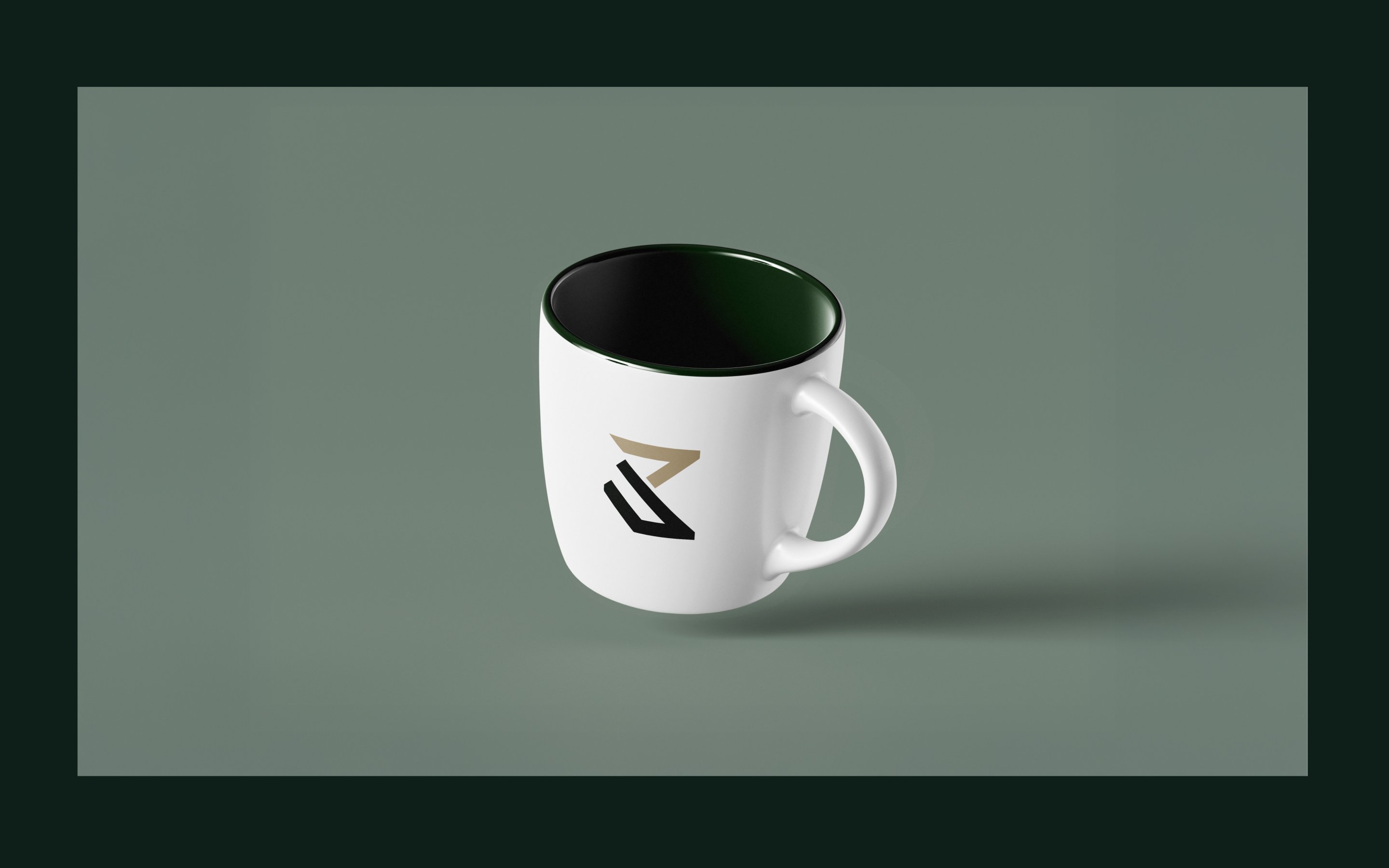
We took the symbol from letterhead to mug, and the line “De quem ajuda a construir o presente” to envelope and notebook.
Product
On the site, the same type and greens; at the end, two doors, Sou Comprador and Sou Corretor, so each lead arrives qualified.
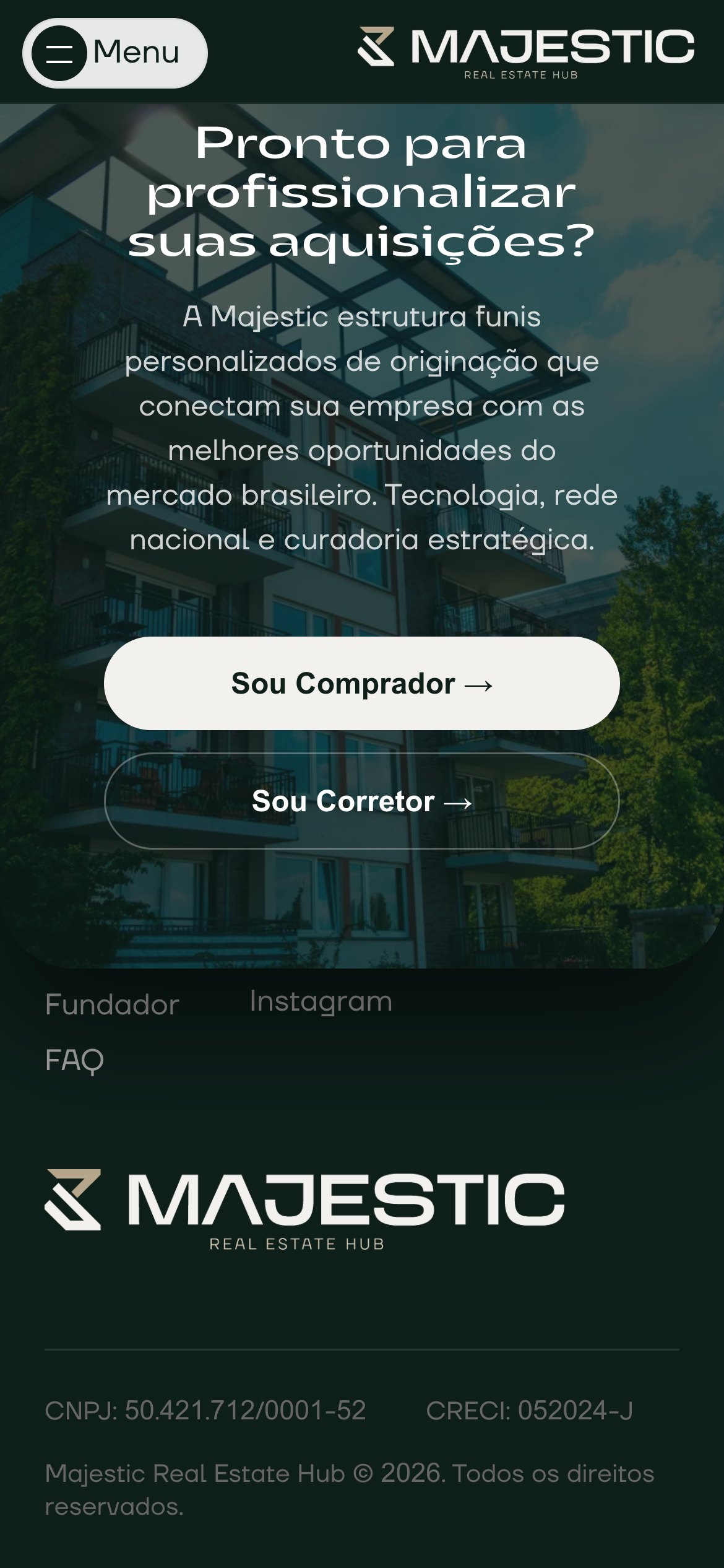
Two doors
On mobile, the closing call keeps both doors, Sou Comprador (buyer) and Sou Corretor (broker), stacked above the footer.
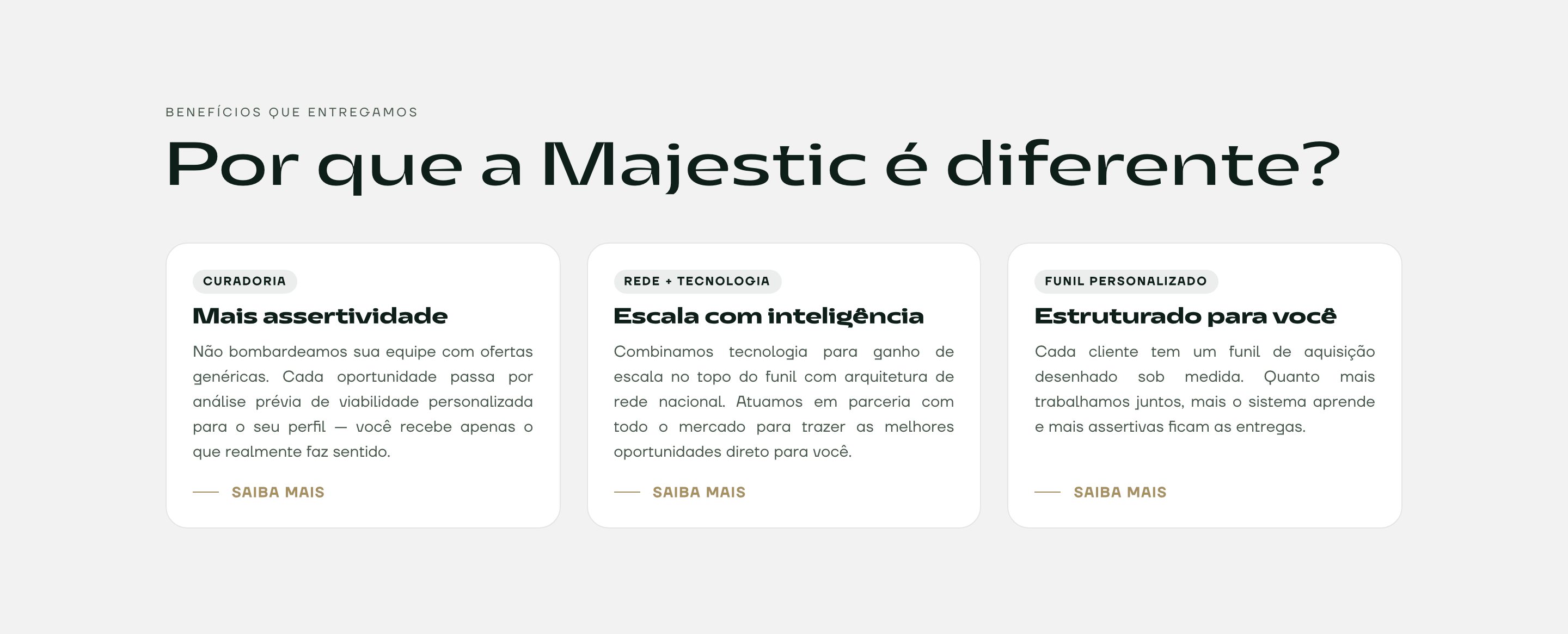
Results
Full identity: symbol, three colourways, five colours and two type families
Icons, buttons, stationery and applications drawn in the same system
Single-page site in the brand's type and greens
Closing call with two doors, Sou Comprador and Sou Corretor, to qualify every lead
Credits
- Visual identity
- Ressolv
- Front-end
- Ressolv
Next project
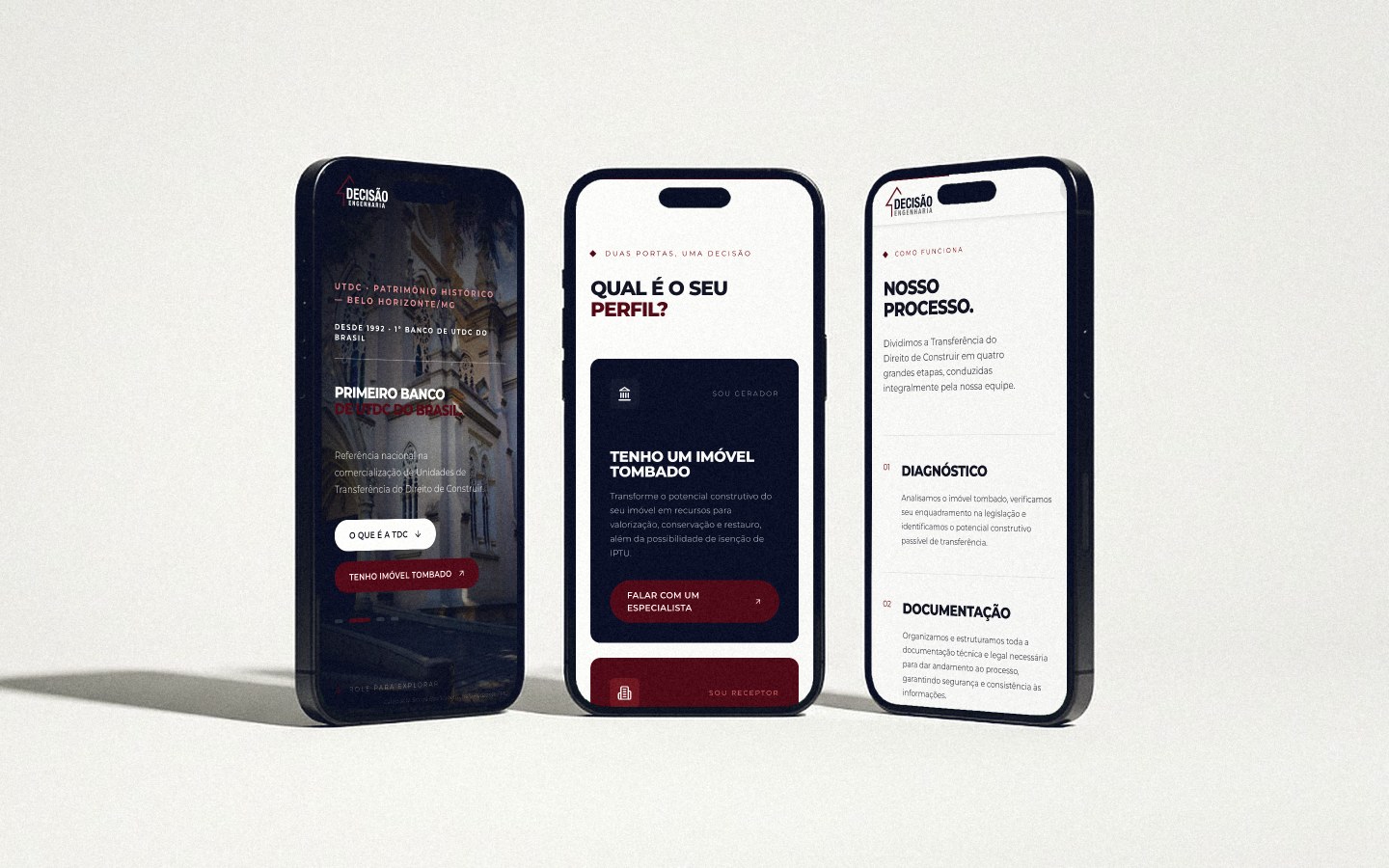
Decisão Engenharia — Institutional Site